Color Theory Basics for Your Home
For a faster, more profitable home sale
 Neutral colors make an excellent backdrop for any pops of color added to your home decor. Photo by rugpadcorner.com.
Understanding color theory and knowing which color combinations will work together is one of the keys to successful home interior design.
Color is one of the most powerful and effective tools for changing the appearance of any room. It can visually expand or shrink a space, raise and lower ceilings and even influence the way you feel.
Whether you are staging your home for sale, or just changing your home decor, a better understanding of color theory will give you the confidence to select paint colors, fabric samples and add art and accessories to your home decor.
If you're planning to stage your own home, select color combinations that harmonize well with each other and flow from room to room.
For example, if you can see your dining room from the kitchen, paint each room the same neutral color, varying shades of that color or in coordinating colors.
Avoid faux wall finishes like sponging, glazing, stucco and embossing, as these styles are simply too taste-specific to attract that larger audience of buyers that you need.
Taste Specific
What does it mean? Taste specific refers to a style that appeals only to a small audience. If you are trying to sell a house, your goal is to decorate it in a neutral fashion, to make it appeal to the largest number of buyers possible. Home staging helps you accomplish this.
The psychology of color
Color theory knowledge isn't just about choosing successful color schemes.
It's helpful to know the effect color can have on our moods, temperature, your blood pressure, metabolism, eyestrain, and even the way you see sizes and shapes.
Did you also know that the colors that you wear can effect the way you feel? Think about that favorite color(s) that you love to wear.
We all respond to specific colors differently, for instance, a cool blue may be relaxing for one person, yet depressing for another.

It's important to consider the use of each room when planning your paint colors. You need to ask yourself what kind of mood you want to create in each space.
For instance, restful colors in a bedroom may not work as well in an energetic area like a kitchen.
Warm paint colors are good choices for active rooms, such as kitchens, dining rooms and children's rooms. Cool paint colors are successful in restful areas, like bedrooms and bathrooms.
Cool colors - Cool colors, (blues, violets and greens) work well in bedrooms because they absorb light instead of reflecting it. The room will “feel” cooler as a result. Plus, cool colors recede and can make a small room seem larger.
Cool colors will effectively reduce the heat in rooms that are too hot in the summer. Cool colors can be used in rooms that you intend to be calm and tranquil.
Warm colors - Warm colors, (reds, yellows and oranges) advance and can make a large room feel smaller and more inviting. Warm colors reflect light, so that walls will let off heat into a room.
Warm paint colors are usually brighter and work well in rooms that lack natural light. If you have an excessively large room, try painting it in a darker color with warm undertones; this will make your room appear cozier. Warm colors are good choices for dining rooms and kitchens.
A successful room will have a combination of cool and warm colors in the design palette, but one or the other should dominate.
Lighting and color - The type of lighting a room has will determine the "temperature" of paint colors you will want to select.
North-facing rooms should be painted in cheerful warm colors to offset the pale light.
South-facing sunny rooms have a bright light that can be tempered by painting in cool or neutral paint colors.
Even a dark windowless room can be lightened up by painting walls in a warm bright light color.
Always try paint samples on a wall first before you commit yourself to a color. Paint colors will change under different lighting situations, and you may decide that you don't like the result. Colors that look great under natural lighting may look washed out under artificial lighting at night.
How color can influence your mood

Red - Red makes us think of valentines, fire, love and passion. This color will actually increase your heart rate, so if you have high blood pressure, avoid painting your walls red.
Red is a stimulating color and works well in rooms where a lot of mental activity is going on, such as an office. It’s also an attention grabbing color--many women wear red lipstick for that very reason.
On the downside, the color red and similar warm colors can evoke feelings of hostility and rage in some people.
Blue - We see it in the ocean, the sky, beautiful Himalayan poppies; blue is certainly a calming and restful color. It will actually lower your blood pressure and when used in bedrooms, will help you settle down for the night.
Reversely, the color blue can also induce feelings of sadness and depression. Hence the song, "I feel Blue."
Violet - The color of royalty, violet is a rich, confident and powerful color. In pale tones, violet can be relaxing. Violet paint colors work well in bathrooms and bedrooms.
It is said that people who suffer from depression should avoid violet, especially in darker shades.
Brown - Chocolate, earth, coffee; this is a comforting color. Brown is a neutral color that can be incorporated in a variety of decorating schemes; it goes so well with most colors. From walls to accessories, brown is a versatile color for use throughout the home.
Orange - Orange is a cheerful, warm and active color. If you enjoy entertaining, use orange paint colors in your gathering places, as the color stimulates people to feel more sociable.
Yellow - Yellow is warming, like sunlight, a happy color that will brighten a dull mood. Use sunny yellow paint colors in your kitchen or craft room, as it is supposed to put you in a creative mood.
On the other hand, if the yellow is too intense and bright, it's liable to make some people feel anxious and distressed. Some people recommend painting a guest room in a blinding, noxious yellow to keep guests from staying too long!
Green - If you have a lot of stress, paint your walls in hues of green. Green is a relaxing and comforting color that will help ease your anxieties. Who doesn’t love the color of nature and desire to bring it inside?
What is the color wheel?

The color wheel, or color circle, is the basis for color theory-- it shows the 12 colors of the rainbow in circle form. Understanding color principles is the key to creating a beautiful home interior.
The color wheel represents the bars of color that light produces as it passes through a prism. When light hits an object, the object selectively absorbs and reflects wavelengths--a blue bedspread reflects the blue wavelengths of the spectrum. Where there is no light, we see blackness.
The color wheel on the right is a diagram showing the relationship between color hues around a circle.
The color wheel is based on red, yellow and blue and consists of warm and cool tones. The color wheel has been around since 1666 thanks to the genius of Sir Isaac Newton and gives us a visual guide of color theory.

Primary colors
The primary colors are red, yellow, and blue. You can’t get these colors by mixing any other colors together. All other colors stem from these three.
Primary colors are placed equidistantly around the color wheel. Using these colors in decorating schemes results in an energetic and lively room design. You often see elementary schools decorated with primary colors.

Secondary colors
Secondary colors are created by mixing equal parts of primary colors in pairs. Secondary colors are:
Orange - Made from red and yellow
Green - Made from yellow and blue
Violet - Made from blue and red.
 Tertiary colors result from a primary color mixed with its closest secondary color on the color wheel.
Tertiary colors
Tertiary colors are created when mixing equal amounts of a primary color with the nearest secondary color on the color wheel.
The six tertiary hues have two-word names:
- blue-purple
- blue-green
- yellow-green
- yellow-orange
- red-orange
- red-purple.
Neutral colors

Neutral colors are black, white, gray, brown, beige and taupe. Earth tones, or colors that occur naturally in nature are considered neutrals as well.
Neutral colors are easy on the eyes, appeal to most people, and work well alone or in conjunction with other colors in any home decor. Neutrals are the favored choice of home stagers because of their universal appeal.

How do you design a room around neutral colors? One possible color scheme is to focus on one neutral, like a white-on-white look. You may use up to 20 different variations of white, from ivory, bone, cream, and white in this interior color scheme.
Home staging shouldn't be bland-- you don't want to bore home buyers! Plus, you want them to remember your house over all the others. You can avoid total blandness by mixing color, pattern, and texture into your home design with accessories, upholstery fabrics, and window treatments.
Be sure to have a good balance of light, medium, and dark tones in a room. Avoid placing all the dark or colorful elements on one side of the room, balance them out. Dark colors are visually "heavier" than light, so this would upset the balance of the room and prevent your eye from moving by stopping "visual flow". See home interior design rules.
Color theory terminology
Hue - A hue is a pure color that doesn’t have any black or white added to it, as in the color wheel. It can also describe colors that are made when you combine other pure colors. For instance, you can describe a color as having a yellow hue, or a orange-red hue.
Tints - You create a tint by adding white to a hue. It is lighter than the original color.
Shade - A shade is created by adding black to it. A shade will be darker than the original color.
Tone - The tone of a color is changed by adding gray or it’s complement. The tone of a color can make a big difference in a room’s appearance. As a rule, lighter tones will make a room appear larger, and darker tones will make a room feel cozier.
Saturation - Refers to the intensity of a color and how a color will look under different lighting conditions. It does not refer to the lightness or darkness of a color.
Value - Value refers to the brightness of a color; whether it is light or dark. The value of a color is based on how close it is to white. (See grayscale.)
Grayscale - A grayscale is a row of neutral colors ranging from white on one end and gradually increasing in value until it reaches pure black on the other end.
Home staging color tips
For an excellent and in-depth analysis on color theory, go to Understanding Color Theory, by the Design Wizard.
Understanding color theory can help you stage your home successfully.
The use of certain color combinations and techniques can visually lengthen or shorten a wall, raise a low ceiling, or make a small room appear larger than it is.
Following are some easy to do color theory fixes for difficult spaces.
Make a small room look larger by using the right colors or patterns

- Pale colors reflect and multiply light, and when combined with lots of natural light flowing in through the windows, can visually expand a small room. Simply painting the walls a light color will appear to push the walls back.
- Avoid using dark colors, which absorb and deflect light and can make a small space feel closed in.
- Cool colors appear to retreat. Use pale cool colors like whites, creams, soft grays, greens and blues when staging a small room. Receding colors will reflect light and create a feeling of spaciousness.
- Light colored flooring, walls and ceiling will visually enlarge a small space.
- Link adjacent spaces with the same light-colored flooring, or at least the same color if floor materials are made of different materials.
- Use white or another very pale color on a low ceiling to visually raise a low ceiling.
- Use window treatments in the same color as the walls in a small room. Avoiding sharp color contrasts in a small space will have an expansive effect.
 White walls, ceiling, flooring and open legged furniture give this small living room an expansive feel. Photo by spaceoptimized.com.
- To create a feeling of maximum space, use the same light color palette on the walls, floors, cabinets, window treatments, and trim work.
- Employ a light hand when adding pops of color, using no more than 2 or 3 colors in a tiny space.
- Swathing an entire room in white will create a uninterrupted space without breaks of color contrast to prevent the eye from moving on. This home design tips fools you into thinking the space is larger than it is. Abrupt shifts from dark to light will trip the eye.
- Remove heavy or dark window treatments that can be oppressive and block natural light.
- Drawing the eye vertically can make a room appear taller than it really is. If you have a low ceiling in your small room, paint subtle wide vertical stripes on the walls, or apply a vertical patterned wallpaper in a neutral tone on the walls.
- To visually lengthen walls, paint neutral-colored, wide, horizontal stripes on the walls.
How to make a large room feel cozy
 This living room with the tall ceilings feels cozy because of warm-colored fabrics and wall color. Photo by godfatherstyle.com.
- For oversized rooms that can often feel cold and distant, paint walls and ceilings in warm and dark color combinations. Dark colors absorb and deflect light and can make a large space feel more intimate.
- Use color and heavy textures in upholstery fabrics, carpeting, and window treatments. Heavy textures absorb more light, making them appear darker.
- Lower a too-high ceiling by painting it in a dark color. Bringing the dark color down onto the walls closer to your line of vision will further enhance the effect by making walls seem less tall.
- For long narrow rooms, paint the end walls in a warm dark color. Because warm colors advance and dark colors deflect light, this will give the effect of "shortening" the room. Be sure to paint the long walls in a soft light color to make them recede in prominence.
Click here to see examples of different room design color schemes.
Watch the informative video below by SessionsOnline about color theory and choosing color schemes by using geometric shapes within the color wheel.
Return from color theory to depersonalizing your home
Go to home page
You may also like
How to create an outdoor living space that buyers will love
15 Small living room ideas that will make it look bigger
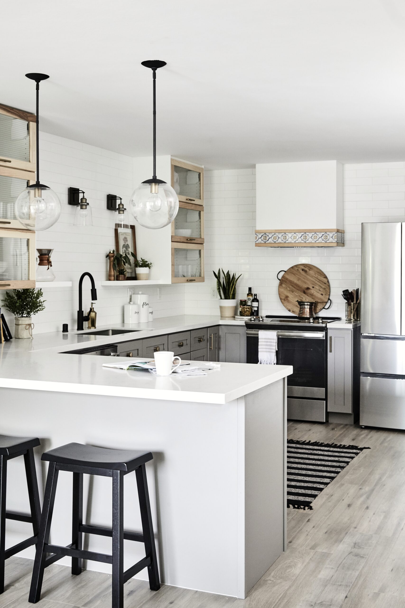
15 Great small kitchen decorating ideas that buyers will love
How to make a vignette like a pro
Leaning pictures and mirrors (the easy alternative to hanging art)
7 Beautiful ideas for painting interior brick fireplaces
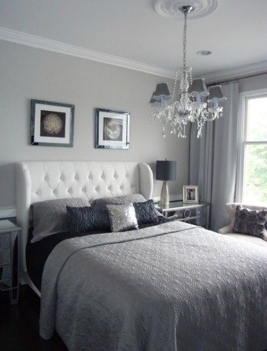
15 Best small bedroom decorating ideas to make it look and feel bigger
6 Must-have online real estate photos
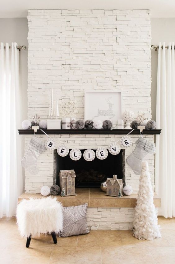
Holiday home staging - a good time to sell your house
11 Great small bathroom design ideas that will sell your home
Painting wood paneling
My best tips for removing bad odors in your home
7 Practical small bathroom storage solutions
Great tips for organizing a successful open house like a pro