Home Interior Design Rules
For a faster, more profitable home sale
Knowing some basic home interior design rules can help you to make better decorating choices for your home.
Have you ever decorated a room and found that it didn't turn out the way you expected? Maybe the color was off or the room felt unbalanced; something just didn't feel right?
One misplaced design element can keep you from achieving perfection! Even one small detail, like a coffee table higher than the sofa, can put an entire room off.
Learn a few basic home interior design rules to help you create balanced furniture arrangements, successful color schemes, and even make a small room feel more spacious.
Basic home interior design rules
Balance furniture throughout a room
Imagine a room as a boat. If you load a boat too heavily on one side, it will list. In the same manner, a room will look unbalanced if you place most of the furniture on one end or corner.
Or perhaps, you have put all the tall furniture on one side and shorter pieces opposite? This can also cause an unbalanced feeling.
Basic principles of balance
- dark colors carry more visual weight than light
- busy patterns are heavier than light solids
- heavy, deep textures appear weightier than smooth surfaces
When planning any room design, divide it into four sections. In visual terms, you want to balance all of your furnishings equally in all four sections of a room.
Crowding furniture pieces to one side will make a room appear horizontally off-balance.
Top or bottom heavy furniture can cause a room to appear vertically off-balance.
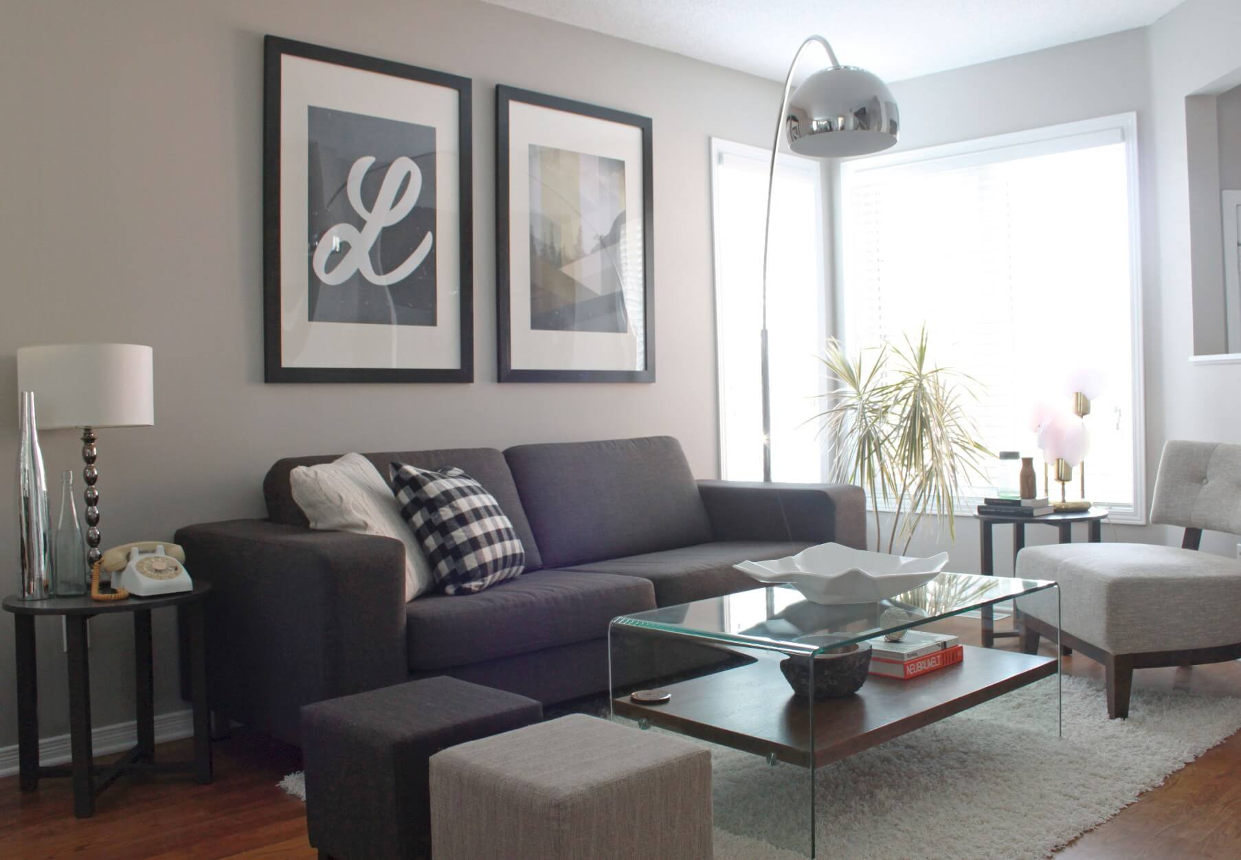
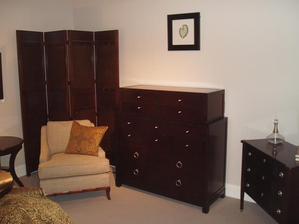
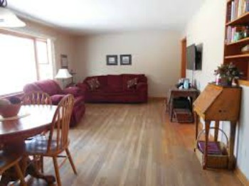 This room actually appears to tilt to the left, because of the weighty couch and loveseat in the far corner.
For example, to balance a fireplace at one end of a room, place an item of equal "visual weight," like an armoire, a window, an upright piano, or a console table with a large piece of art above.
If it's a window wall, hang window treatments of equal value to the fireplace opposite.
A sofa on one side of a room could be balanced by 2 chairs on the other; a loveseat and side table, or another sofa of similar weight.
Avoid the mistake of offsetting dainty furniture with bulky furniture, like a heavy leather sectional sofa.
Color, pattern, and texture have weight as well. Dark colors, and busy or elaborate patterns feel visually "heavy," whereas, pale colors and smooth fabrics feel light and airy.
What is "Visual Weight?"
Visual weight refers to how much weight an object APPEARS to weigh when you look at it, not how much it actually weighs.
For instance; a black sofa will appear to weigh more than a white sofa in the same style, because dark colors have more "visual weight."
Dark colors can create a "closed-in" feeling. Light colors can visually expand a small space.
Symmetrical, or formal balance
Symmetrical, or formal balance is for those who prefer an atmosphere of order, calm, and formality in their interior decorating.
People who love symmetry are often disturbed when they walk into a house, or room that is unbalanced. They may not even know why, they just know that they feel uncomfortable.
Formal home interior design rules are based on symmetry. Arranging furniture symmetrically is fairly easy to do, because you are simply trying to "match" each side of a room.
To do this, envision an imaginary axis line going down the middle of a room. Symmetry is created by using identical (or like in size and shape) pieces of furniture on each side.
For instance, the axis line of a room may go down the center of a fireplace. Your fireplace may be flanked by matching bookcases or windows.
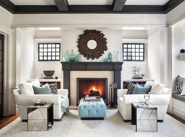
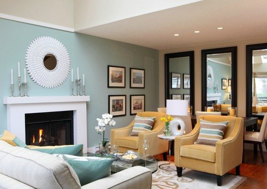
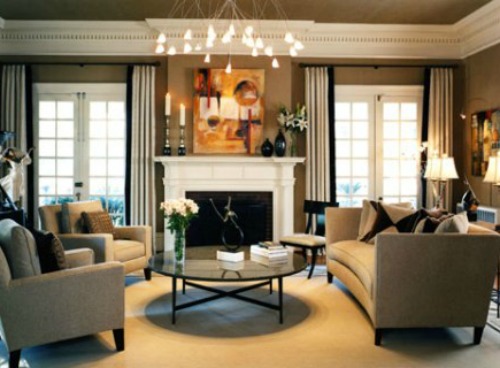 Here is another example of a symmetrical living room, except here we have two chairs that balance nicely across from the sofa.
To create a symmetrical look, place identical chairs, loveseats or sofas on each side of the fireplace, along with matching (or like) side table and lamps.
Or place a sofa facing the fireplace with a coffee table in front and two cozy chairs flanking each side for a cozy conversational area.
Asymmetrical, or informal balance
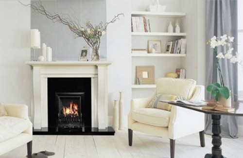 An asymmetrical room still needs to be balanced, though each side just won't match the way a symmetrical room does.
Asymmetrical, or informal balance is for those who prefer informality, energy, and creativity in their home decorating.
An asymmetrical room may give you a fireplace that is off-center, an off-center window, or architectural details that make it a challenge to arrange your furniture around, like a spiral staircase.
You still need to create visual balance in an asymmetrical room, but achieving this look requires a good eye and a little decorating know-how. An understanding of "visual weight" and balance will help you out.
The effect of "line" in home design
If you glance around the room you're sitting in, you may notice lines going in many different directions; in the windows, the horizontal line of your sofa and coffee table, vertical lines of floor lamps and draperies, curved lines of a round table, and so on.
The lines in a room create movement, atmosphere, and whether a room feels feminine or masculine. Following are some basic home interior design rules to guide your decor choices:
- Straight lines - Examples of straight lines can be found in chair rails, doors, windows, and square tables. Straight lines are considered masculine and strong in the world of home decorating.
- Curvy lines - Curved lines can be found in arches, round tables, lamp shades, and round rugs. Curved lines add a feminine and graceful component to a room.
- Horizontal lines - Horizontal lines occur in the lines of a bed, a wide window, shelving, and long tables. They add strength and a sense of peace to a space.
- Vertical lines - These lines are typically seen in tall windows, ceiling to floor window treatments, and armoires. Vertical lines add height, drama, and a sense of formality to a room.
- Diagonal lines - You might find this type of line in fabrics, the legs of a coffee table, or a piece of artwork. Diagonal lines add a sense of movement to a room.
"Color" in home design
Color is the key to all successful decorating— it can work magic by visually expanding or shrinking space, raising and lowering ceilings, and even effect our dispositions.
Knowing some basic home interior design rules of color theory will help you make good choices with your color schemes.
- Pale colors reflect light, and can visually expand small spaces by giving the impression of pushing back the walls.
- Dark colors absorb and deflect light and give the impression of the walls closing in on you.
- Cool colors appear to retreat, while warm colors seem to advance.
Introducing too many different colors in a small space can overwhelm a room.
If you have a house for sale, avoid painting walls in dark or bright colors. This may discourage some home buyers from making an offer because they consider repainting too much work.
Soft colors and lustrous fabrics will impart a feeling of luxury to any room. Soft blues, greens, grays, whites and creams are restful colors that will tempt home buyers.
Paint your home in neutral colors, which are preferred by more people than any other colors. Neutral colors are the easiest to decorate with because they blend well with most surroundings, and go with most people's furniture.
Balance color in any room with the 60-30-10 rule:
60% of a room is usually a dominant color - This is typically the wall color.
30% of a room is the secondary color - Furniture, drapes, carpet.
10% of a room makes up the accent color(s) - Accent colors are those "pops" of color that brighten and add excitement to a room.
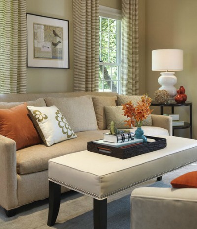
Find color in accessories like pillows, artwork, throws, window treatments and floral arrangements.
The accent colors and patterns you choose for a space should be evenly distributed throughout the room. Don't place all your accent colors (and patterns) on one side of a room.
Paint colors should flow gracefully from one room to the next, especially if you can see adjoining rooms, as in open-concept living areas. You can achieve this by painting all your walls in the same paint colors, in coordinating colors, or in lighter and darker shades of the same hue.
"Pattern" in home design
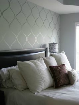
Pattern is a decorative design or form that repeats itself. Patterns have a distinct effect on the look and feel of a room.
For instance, light floral patterns will lend a room a fresh and open feeling, whereas, large heavy floral or paisley patterns can make a room feel formal and stuffy.
Below are some examples of how pattern effects home design:
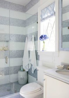
- Keep patterns to a minimum in a small space.
"Texture" in home design
Everything has texture, whether smooth or coarse. Texture is that one element of home decorating that really jazzes things up! If your home design seems boring to you, it may be lacking this essential element.
In the absence of wild patterns and bright paint colors, texture will add some excitement and interest to any room.
- Vary the textures of things you can touch (tactile) and things you look at (visual) to liven up a space.
- Avoid heavy brocaded fabrics, textures, and dark colors in a small rooms.
- Light fixtures can have texture as well. For instance, polished chrome can be smooth and sophisticated, and wrought iron can add a rustic feel.
- Shiny, satiny fabrics on bedcovers, window treatments, or accent pillows will illuminate a space. A glass tiled back splash in bathrooms and kitchens will illuminate as well.
- Use fabrics with texture rather than pattern on larger pieces of furniture, such as a sofa, so as not to overwhelm a small space.
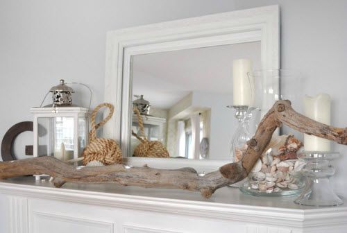
- Create a vignette with elements from nature with varying textures to add interest.
"Scale and proportion" in home design
Scale usually refers to the size of an object in relation to the human body, or to the room itself. Proportion refers to the size of an object relative to other objects in a room.
To demonstrate how scale and proportion work together, consider how dining room chairs need to be in scale to the dining table, and the chandelier above should be in proportion to the table below.
A room simply looks and feels better when furniture is similar in size and scale. If you introduce one tall piece of furniture into a room full of shorter furniture, the effect can be uncomfortable. Your eye will travel up and down like a roller coaster as you look around the room-- the rhythm will be off.
How do you know if your scale is appropriate? After you have moved your furniture in, stop and take a look at the tops of your furniture, starting from one end of the room and making your way around.
Have you managed to maintain a gradual line, or is your eye bouncing up and down? If the line has extreme highs and lows, you might consider different furniture or making adjustments in that room.
The "roller coaster" effect can be softened by adding artwork, lamps, or plants to create extra height where needed.
"Rhythm" in home design
Rhythm is another key element of home interior design rules-- it is the path that your eye follows when you enter a room.
Successful room design will encourage the eye to move around a space in an organized fashion, taking in every element of the arrangement.
Well constructed rhythm will unify and bring a sense of balance to a space.
Rhythm is built upon five precepts: contrast, repetition, gradation, transition and radiation.
Contrast - Rhythm occurs when design elements of opposing colors or shapes are used together. For example, the contrast of black countertops against white kitchen cabinets creates excitement in interior decorating.
Repetition - Rhythm also occurs when a design element is repeated throughout a space, such as similar colors, patterns, shapes, textures, lines, and forms. Using similar elements creates unity and ties the room design together.
Radiation - Radiation is a balance and repetition of elements designed around a central point. The most obvious example is a round table with a center piece, dining chairs, and maybe a round light fixture radiating above it. It's the repetition of circular objects that create a sense of balance.
Gradation - Rhythm can be achieved by accessorizing with like objects in different sizes, from small to large, or by using one color in varying shades of light to dark. The eye will follow the gradation line in a smooth rhythm. A row of different sized candlesticks on a fireplace mantle is an example of gradation.
Transition - Transitional rhythm is fairly subtle; it is how something transitions from one element to another. The goal is to successfully guide your eye in an uninterrupted fashion from one part of the home to another. For instance, a row of similarly framed pictures can lead the eye to flow smoothly down a hallway or a staircase.
Return from home interior design rules to arranging furniture
Go to home page
