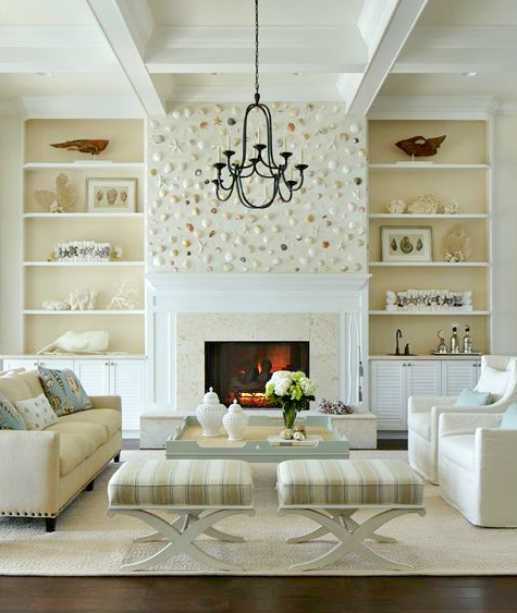
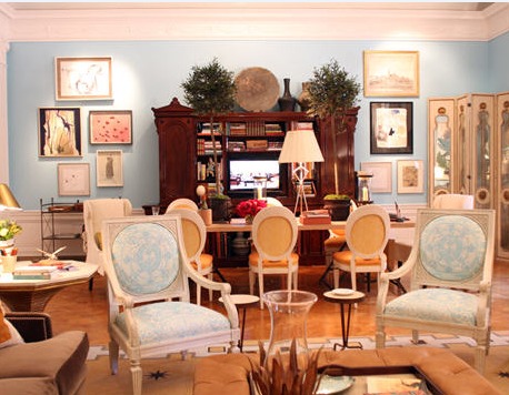
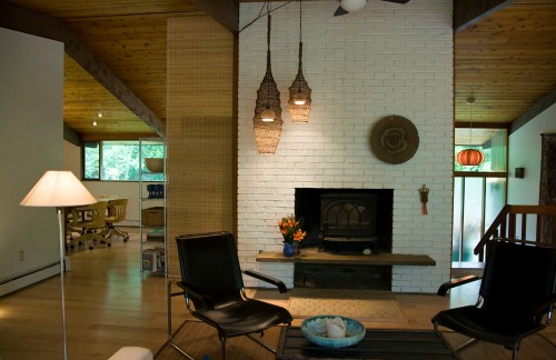
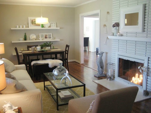
Space Planning Basics for the Home
For a faster, more profitable home sale
What is space planning and what does it have to do with your home?
Space planning is the study of how we use the spaces in our home.
It involves the study of traffic patterns, balance, visual weight, scale and axis.
The function of a room also helps us determine how to use the various zones of a room to properly arrange furniture.
Having an understanding of space planning basics for the home will help you select the best place for your furniture, highlight a room's best features, achieve perfect balance, and maintain good traffic flow.
All these things are important when you are staging a home for sale.
Keep reading to learn how the shape and architecture of your home can guide you to successfully place your furniture in the best positions.
The goal in home staging and interior decorating is to arrange furniture to complement architectural features and/or a focal point in the rooms of your home. The right furniture layout can also give you the illusion of more space in your home.
When space planning, it helps to remove the distraction of furniture from a room so you can assess the shape, architectural details, natural focal point(s) and traffic patterns. I like to work with a small scale drawing of a room instead. (I only want to move furniture once!)
Space planning questions
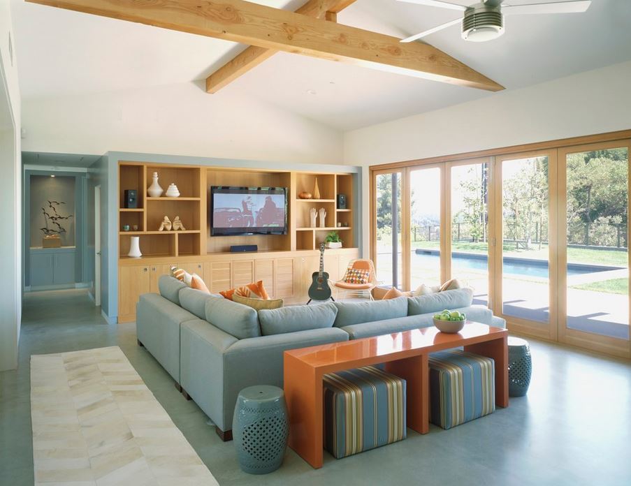 An L-shaped sofa and small chair is all you need to properly use this space. You can take in the view outside or watch TV. Traffic flows nicely around the sofa. Photo by Gus Duffy.
Step back and examine the shape, architectural details and traffic patterns of your room. What is the first thing that jumps out at you?
- Are there any features or focal points that catch your eye? A beautiful window, striking view, a fireplace? Any interesting architectural details? Sometimes a room is just a plain old square and you'll have to create your own excitement.
- Can you identify the traffic areas in each room? (See below)
- Are there any awkward angles or areas that you will have to work around, like a protruding radiator or a removable floor hatch?
- How many people will be using the space?
- What is the best way to arrange furniture that will complement the room’s features, function well and open the space up?
- What furniture do you already have that will work in the room?
What is a traffic pattern in home decor?
Traffic pattern, or traffic flow, is the natural progression of people traveling through a room, the paths in and out, and the areas where you walk the most. In carpeted rooms, you often see a lot of wear in the carpet where the highest concentration of traffic occurs.
With proper space planning, there should be enough space for people to travel comfortably in and around the furniture or through the room.
It’s important to establish your traffic pattern before you place your furniture. Watch out for door swings and windows; leave room for opening and closing them. You should have a comfortable 24” of space in which to maneuver in and around furniture.
Identifying the focal point
The first thing you should do in space planning, is identify a focal point. The focal point will be the first place your eye goes when you enter a room.
Look for architectural details, lovely windows, a great view or attractive fireplace. Be aware that some focal points can be ugly, like a bulky air conditioner on the wall. Often a room will have no focal point, so you will have to create one.
You may have more than one focal point. Can you pick out the predominant one? (The main focal point will overshadow others by it's sheer magnificence!) If so, then this focal point, plus the shape of the room, will be the design inspiration for your furniture arrangement.
Room shapes
Rectangle (oblong) rooms
Rectangular rooms are the most common room shape and are typically multi-functional because of the length. In space planning, a rectangular room is usually easy to work with. For a particularly long and narrow room, arranging furniture into two separate areas will help break up the length of the room.
Arrange furniture into two separate cozy conversational areas on opposite ends of the room. Or, create a child’s play area on one end, a game, or media space.
The popular "open concept" living spaces that encompass a kitchen/dining/living room or kitchen/dining areas are often rectangular in shape and examples of multiple functions occurring in one room.
L-Shaped rooms
Like rectangular shaped rooms, L-shaped rooms usually have more then one function. This is where space planning can be tricky. Examples of L-shaped rooms might be kitchen/dining rooms, living/dining rooms, or bedroom/bath.
It's important to have flow from one section of the "L" to the other. An effective way to do this is to arrange your furniture in both parts of the "L" in parallel angles to each other. This will unify the two areas and create good flow.
For tips on creating good flow with color, see interior colors for home staging.
Off-Angle shaped rooms
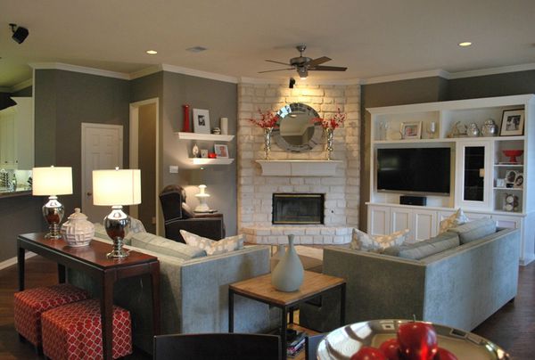 See how the furniture is placed at angles toward the fireplace focal point?
This is a good solution for an angled wall.
See how the furniture is placed at angles toward the fireplace focal point?
This is a good solution for an angled wall.An off-angle shaped room is simply a square or rectangular shaped room with a corner, (or corners) cut off at angles. Typically, the angled corner may be a fireplace, a corner cupboard, or other interesting architectural detail.
If the angled wall makes a good focal point, a sofa can be arranged parallel to the wall, with two side chairs perpendicular (at right angles) on each side of the sofa.
Round or oval shaped rooms
Round or oval-shaped rooms are far from standard and can be a challenge to decorate. Placing a round table in the center is one solution. A modular curved sofa with angled chairs facing would work as well.
For round or oval-shaped rooms, imagine a square inside the round walls and place your furniture within that square, as you would in a square or oblong room.
Placing a round table in the center is one solution. A modular curved sofa with angled chairs facing would work as well.
Or, embrace the circle by arranging circular seating about a round game table above a round area rug!
Where ceilings and walls meet
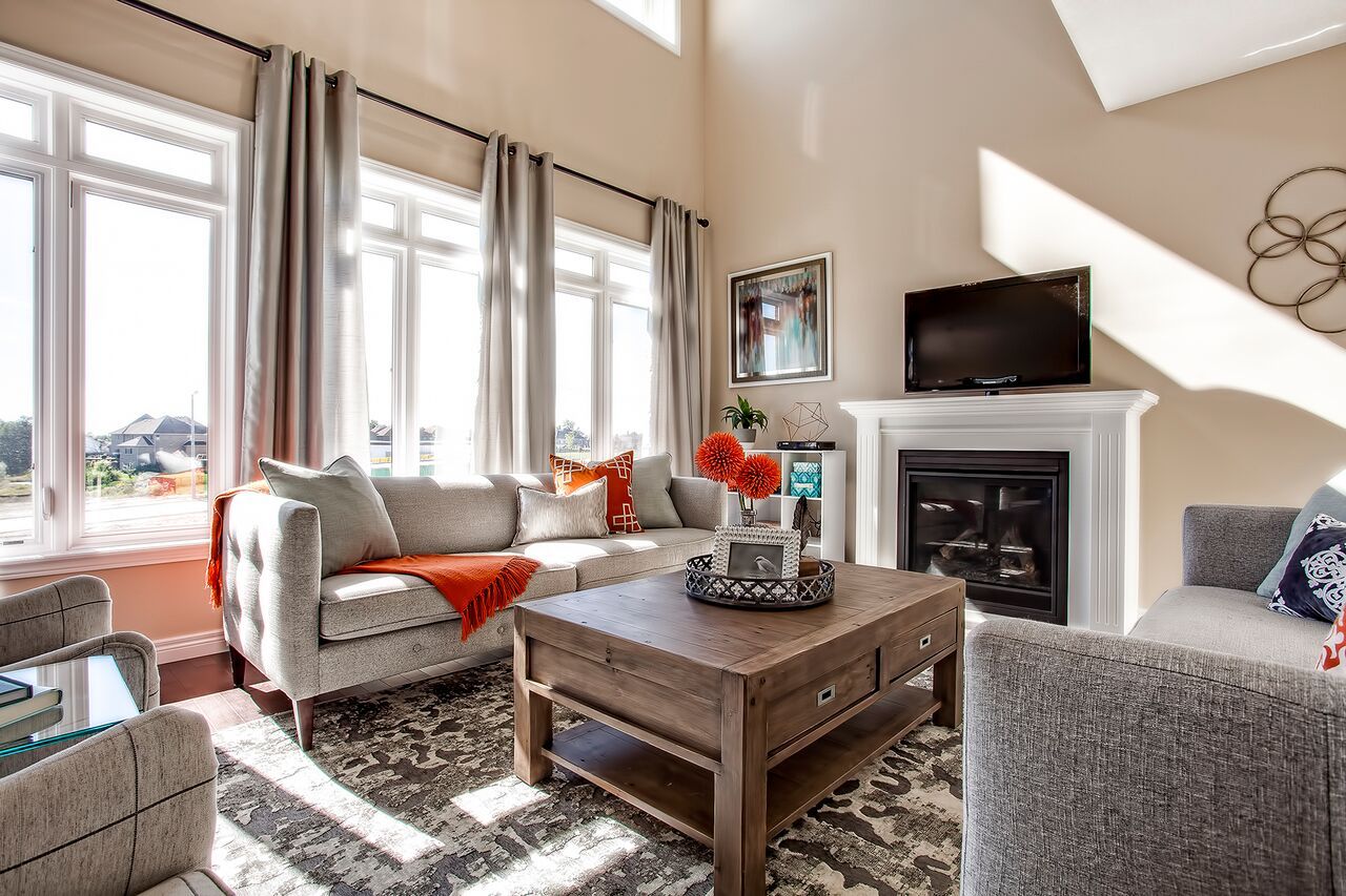 Notice how the artwork and draperies are hung higher than normal where the ceiling is higher? Furniture is bulkier in scale to fit the large size of the room. Photo by furniture4world.blogspot.com.
How do your ceilings and walls meet? Do you have lofty peaks in the center and only four feet of standing space at the walls? Do you have straight or cathedral ceilings?
In space planning, the rule of thumb is to place tall and bulky furnishings along high walls, particularly in the center of a peak. Place lower profile furniture along the sides. In a tight bedroom, place the head of the bed against the lowest side.
If you don’t have tall furniture, you can substitute by placing artwork or accessories, plants and baskets on top to create vertical height to balance the room.
Add a skylight to a slanted ceiling that offers no usable space. This will take away that closed in, claustrophobic feeling that low slanted ceilings can give.
What is visual weight?
Everything that you place in a room has a visual weight. This is an important consideration when you plan your furniture arrangements in a space.
What is "Visual Weight!"
Visual weight refers to how heavy an object APPEARS to be when you look at it, not how much it actually weighs. Visual weight is determined by color, patterns, textures, design, even the shape or structure of an object.
For instance, darker colors carry more visual weight than lighter ones. A black leather sofa will visually outweigh the same sofa in white.
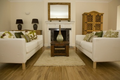
Note the lamps next to the fireplace in the photo above. Although the lamps are smaller than the armoire placed on the other side of the fireplace, the dark color of the lamps gives added weight that balances with the lighter colored armoire, in spite of it's bulk.
For more information on visual weight, go to working with visual weight in your design.
- Interior designers and home stagers love to use glass or lucite furniture in small rooms, because they VISUALLY take up less space. When space planning, consider that a solid table will "stop" the eye, whereas, a glass top table extends sight lines, by showing the room beyond and the floor below. This is why designers like to use glass-fronted cabinets in small kitchens.
For a more in-depth analysis on "visual weight," go to color, texture affects visual weight.
"Balance" in space planning
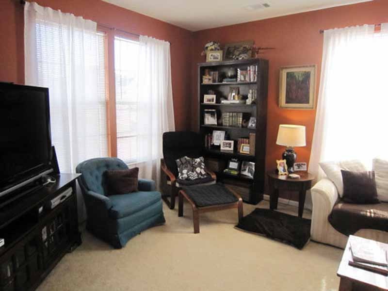 This room is unbalanced by color, (black feels heavier than white) and the sheer number of pieces on the left. Even the black dog bed on the floor adds weight!
Balance plays a key role in space planning. Imagine that your room is a boat; divide it into four equal sections. If you place all your heavy furniture in one corner or on just one side of the room, your “boat” will list to that side.
In visual terms, you want to balance all of your furnishings equally in all four sections of a room.
- DO NOT offset dainty furniture on one end of a room with a bulky leather sectional sofa on the opposite end! In fact, these pieces shouldn't even share the same room.
"Scale and proportion" in home design
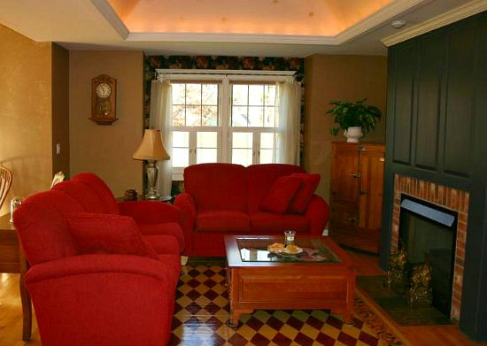 The massive red sofas and coffee table overwhelm this small room.
Scale usually refers to the size of an object in relation to the human body or to the room itself.
Proportion refers to the size of an object relative to other objects in a room.
To demonstrate how scale and proportion work together think about how a lamp shade should be in proportion to the lamp base, and the lamp should be in scale with the table it is on.
A room works better when furniture is similar in size and scale. If you mix tall furniture into a room full of short pieces, the effect can be uncomfortable. Your eye will be traveling up and down as you look around the room. How do you know if your scale is appropriate?
After you have moved your furniture into a room, stop and take a look at the tops of the furniture, starting from one end of the room and making your way around. Is your eye traveling on a roller coaster or have you managed to maintain a gradual line? If the line has extreme highs and lows, you will need to consider different furniture or make adjustments in that room.
If you need to add height, place plants, baskets, or sculptures on tabletops, or hang pictures above to draw the eye upward.
"Axis" in home design
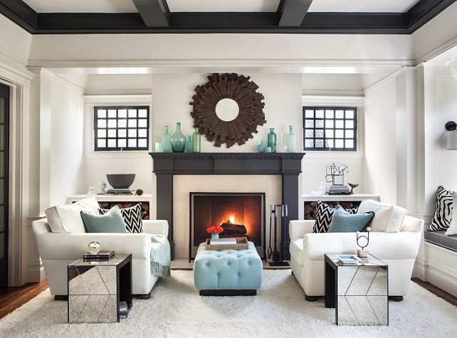 Arranging furniture in this room is simplified by the symmetrical architecture of the room. Photo by homescapes-sd.com.
The axis is a widely used principle in home interior design. An axis is an imaginary line. The easiest way to achieve a nice balance in space planning is through the use of symmetry (or implied symmetry) around a center axis.
Most of us are comfortable with a house design that is well balanced. We may not know it, but we feel good when we enter a house and see a room on the left and a matching room on the right. The two rooms provide symmetry and a sense of order that just feels right.
When designing your furniture arrangement, imagine a dividing line down the middle of the room, usually at the greatest length. The elevation and focal point of a room should be considered, as well. Your goal is to make the focal point dominate the eye from floor to ceiling.
For example, adding a large piece of artwork, mirror, or tall accessories on a fireplace mantle will visually heighten and draw the eye upward, as in the picture above.
If possible, balance the fireplace on the axis of the opposite side of the room with something of similar width and height. You could use an armoire, a tall entertainment unit, even a low piece of furniture with artwork hanging above it to add extra height.
Asymmetrical rooms need to be balanced in the same fashion, it's just a bit trickier.
To learn more about symmetry, asymmetry, and radial balance, view the video by Mary Swanson (Screencast-O-Matic.com) below:
Return from space planning basics for the home to home page
