The Best Interior Colors for Home Staging
For a faster, more profitable home sale
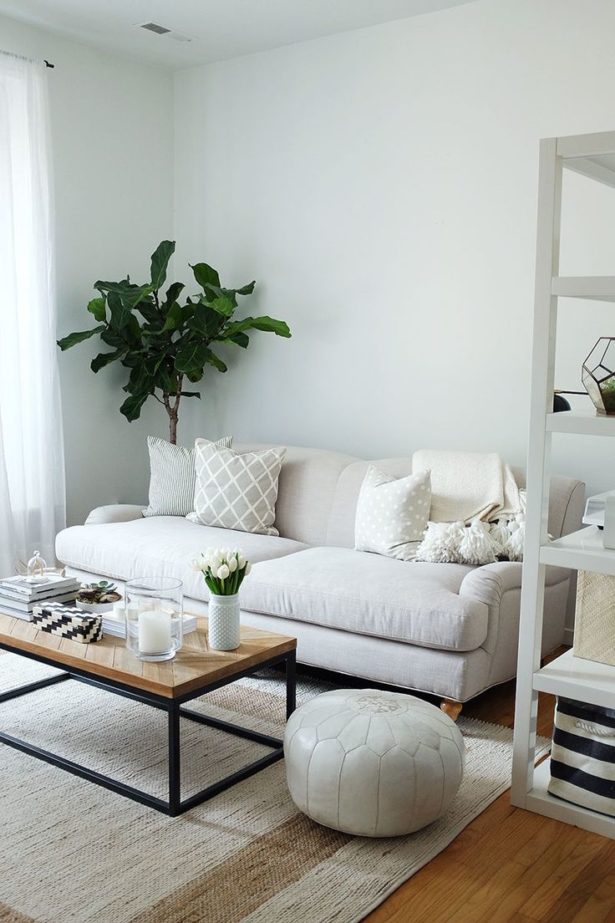
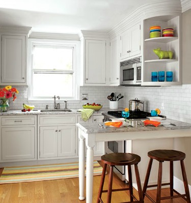
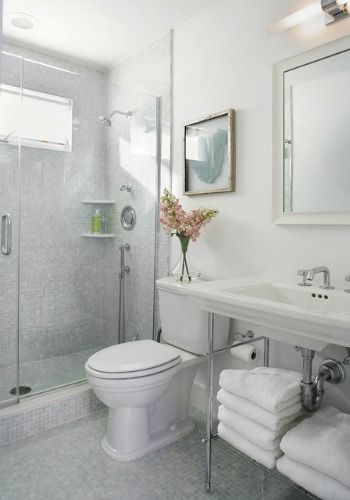
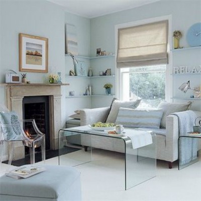
Interior colors for home staging should be selected from the color palette that appeals to most buyers. Neutral colors!
What are neutral colors? In a nutshell, a neutral color is one that blends into the background.
Neutral colors are remarkably versatile; they provide the perfect canvas for all other colors that you place against it, making them the ideal backdrop for displaying artwork.
Neutral colors are relaxing, calming and often appear to have no color.
If you have a house for sale, changing wall paint colors is the fastest and most economical way to update your entire home. The trick is to select colors that coordinate and flow from room to room.
Paint colors that are too bold, dark or bright, may turn away some buyers away because they will be thinking of all the repainting they will have to do. Sadly, not everyone will like your color choices.
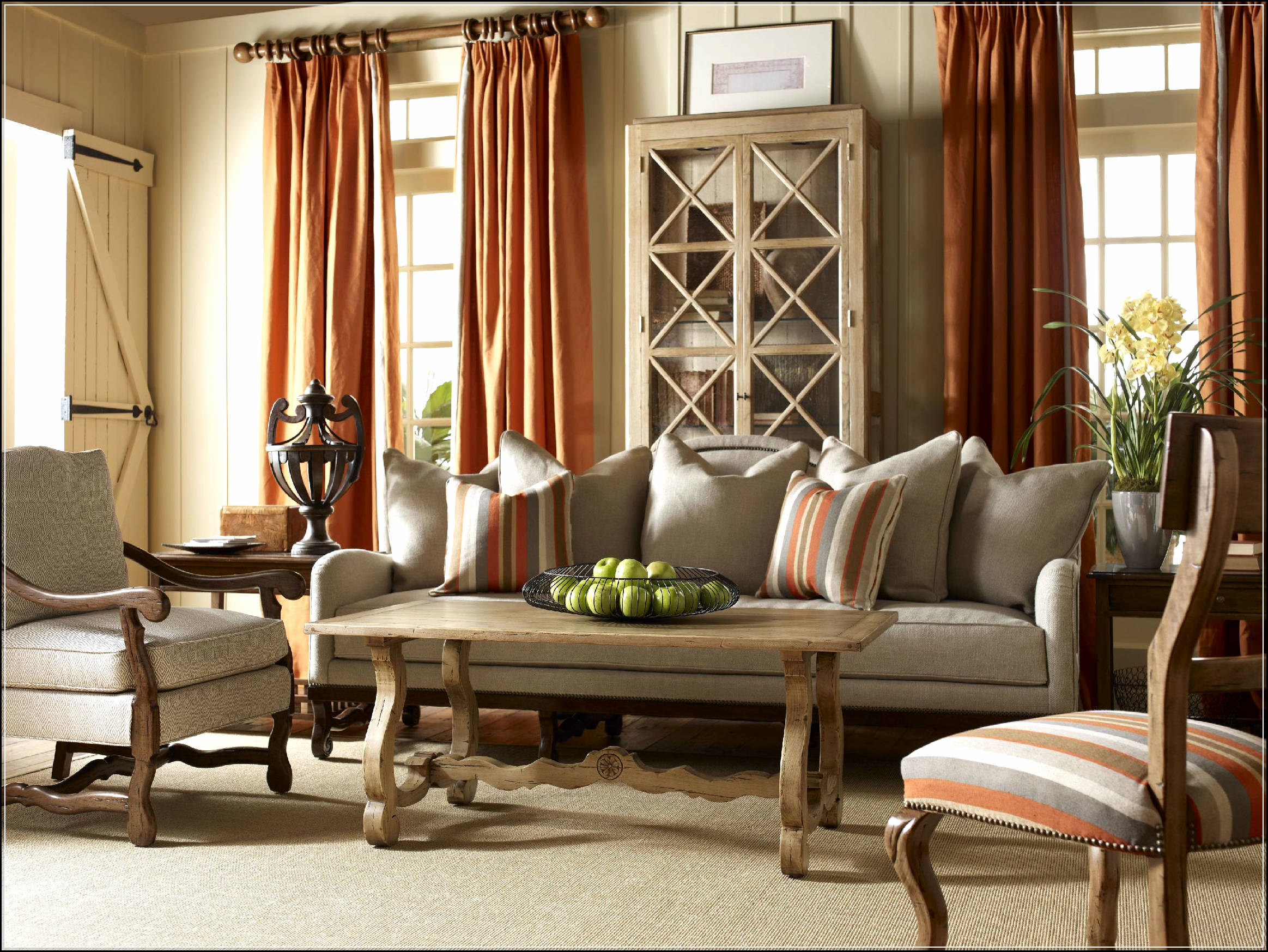 This dramatic living room has perfectly balanced colors using the 60-30-10 home decor rule. A neutral-colored background softens the orange accent color. Photo by godfatherstyle.com
Balance color in any room using the 60-30-10 rule:
60% of a room in a dominant color - Typically the wall color
30% of a room in a secondary color - Furniture, drapes, flooring
10% of a room in accent color(s) - Accessories: pillows, art, blankets
What do neutral colors look like?
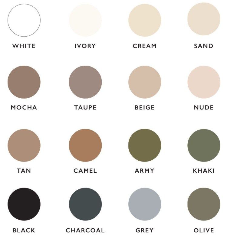
Neutrals include black, white, all the grays in between, beige, white and earth tones.
Best of all, neutrals appeal to both sexes and work successfully in all room designs.
Neutral colors have the widest appeal among home buyers, plus, a neutral color palette will complement most people’s furniture.
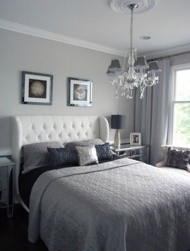
Some people think a neutral color palette will be boring. Au contraire! This color combination can be very restful and sophisticated, as in the bedroom pictured to the right.
Examples of interior colors for home staging that most people love are; beige, taupe, ivory, coffee tones, honey, butter, golden, wheat, blue-green, mossy green, brown, blue-gray and gray.
Gray is a sophisticated color and very trendy at this time.
Gray complements all other colors and serves as an excellent backdrop for bright colors, allowing them to stand out.
Interior colors for home staging
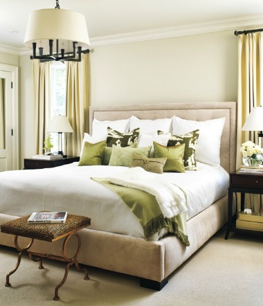 A monochromatic room decor with green accents gives this bedroom an elegant, lush feel.
Classic home decor design starts with one main color and one to three accent colors.
Find a color you really like; perhaps drawing color cues from a favorite fabric, area rug or painting.
The easiest way to prepare your home for sale is to paint every wall in the same neutral color.
Each room will look slightly different, because of color changes under varying light conditions.
Or, create good color flow from room to room by using lighter and darker values of the same color.
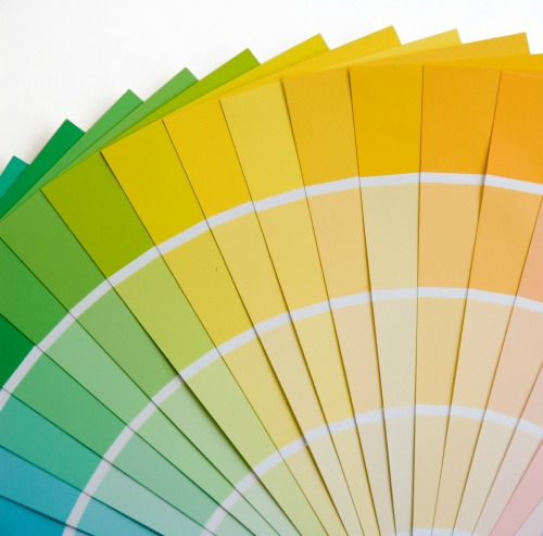
Pick up a color fan paint sample (you will have to pay for this; $24 to $38) or free paint color swatches from any home improvement store to help you select interior colors for home staging.
A paint sample strip has a selection of one color in several different values.
Value: Varying degrees of light and dark-- the "brightness" of a color.
Select a monochromatic color scheme. Doing so will help with the flow from room to room.
Stick to a color palette of no more than 3 to 5 different colors in your entire home.
Paint colors for home staging
I love Benjamin Moore paint because of its high saturation, meaning it has great coverage. You can often get by with just one coat of paint.
It's the best paint for kitchen cabinets, as well. Look for Benjamin Moore paint at Home Depot.
Many paint companies offer sample-size containers of paint you can take home to try on the wall before committing to a color.
Note that paint color palettes change every few years, so if you're looking for that great color you used 3 years ago, you won't find it!
But don't panic, most paint stores now have the technology to match any color, you just need to bring in a color sample.
The effect of lighting on paint colors
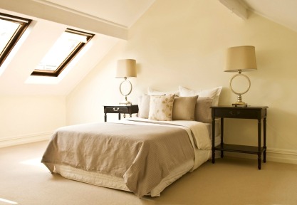 This monochromatic bedroom is infused with natural light. Natural light creates a feeling of spaciousness, important in a small room.
Color will change according to the type of lighting you have in a room. A color you're happy with in natural light will look completely different under incandescent lighting.
What kind of natural light does each room have? Are you going to be using the room mostly at night under artificial lighting or during the day? Is the room facing north or south?
Consider the room that you'll be adding color to and view your paint samples under all lighting conditions and at different times of the day.
- Incandescent light will typically add a warm yellow cast to colors.
- Colors that look vibrant in natural light will often wash out under incandescent lighting.
- Fluorescents create a cooling gray cast.
- Halogen bulbs produce a very white light and have little effect on color tones.
Consider the effect of natural light exposure in each room:
- Dark colors in a north facing room will make the room appear darker. In addition, a north facing room will be cooler, so select a warm paint color to help take away the chill.
- Paint colors will seem lighter and brighter in a room with a southern exposure, as they get plenty of light during the day. Tone down harsh lighting by painting in cool, neutral colors.
What is a color undertone?
How many times have you painted a wall and the color wasn’t what you expected? You thought you were going home with a soft ivory color, but once up on the walls, it turned into a pale pink!
How does that happen?
Color undertones aren't always apparent until paired with other colors or viewed under certain lighting conditions. It's like a covert color within the paint!
When you first look at a color you see what is called a mass tone. This is the color we all recognize right away. Hidden within the mass tone is an undertone, not easily seen.
A color is created by mixing two or more colors together. The color that is used in greater proportion will determine the undertone of the color.
For instance, if more green is used than any other color in the mixing, then green will be the undertone.
To check for color undertone in a room, hold a paint color sample against your furniture, kitchen countertop, cabinets, flooring and under different lighting conditions. You may be surprised at the undertone that pops out.
Years ago, I rushed home with four cans of what I thought was a luscious taupe exterior house paint. After painting one side of my house, a neighbor stopped to ask why I was painting my house purple.
Puzzled, I stepped back to take a broader look and was horrified to see that a lilac undertone had popped out! Back to the paint store...
Color flow from room to room
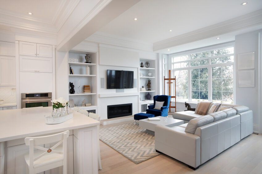
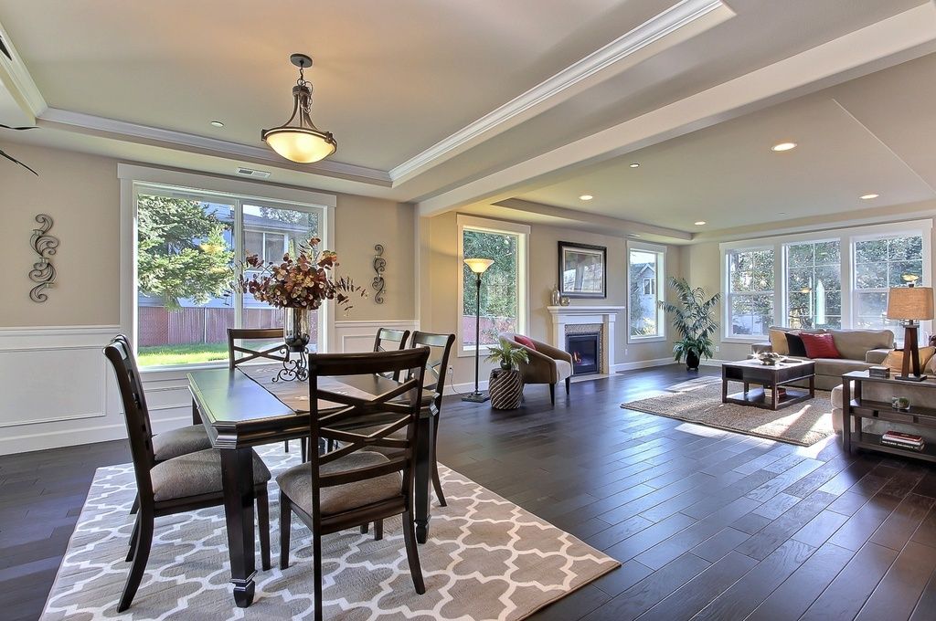
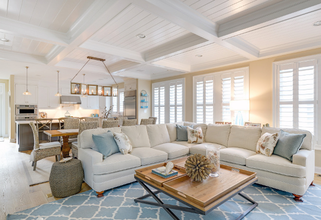 White coffered ceiling, wood flooring, and blue accent colors seamlessly tie this open concept kitchen/living room together. Photo by homebunch.com.
Interior colors for home staging should flow gracefully from one room to the next, especially if you can see adjoining rooms, as in open-concept living areas.
You can achieve this by painting all the walls in the same neutral paint color, in coordinating colors, or in lighter and darker shades of the same hue.
Another way to develop flow is by carrying one recurring color from room to room.
For instance, the sofa color in the living room can be carried into the dining room in the form of an area rug, upholstered dining chairs, a tablecloth or artwork.
Undertones aren't always apparent until paired with other colors or viewed under certain lighting conditions. It's like a covert color hiding within the paint.
When you first look at a color you see what is called a masstone. This is the color we all recognize right away. Hidden within the masstone is an undertone, not easily seen.
A color is created by mixing two or more colors together. The color that is used in greater proportion will determine the undertone of the color. For instance, if more green was used than any other color in the mixing, then green will be the undertone.
Hold a paint color sample against your furniture, kitchen countertops, cabinets, flooring and under different lighting conditions. You will be amazed at the undertones that pop out.
Use color to create illusions
Color is one of the keys to all successful decorating— it can work magic by visually expanding or shrinking space; it can appear to raise or lower a ceiling, or lengthen or shorten a room.
You can fool the eye by using certain colors in the right places. Color can make objects visually advance or recede, and knowing where and how to use them can help you highlight focal points or camouflage unwanted features of your home.
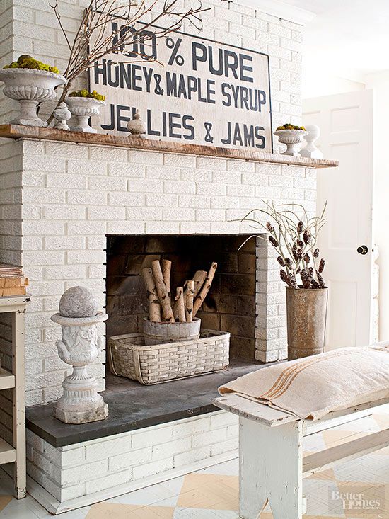
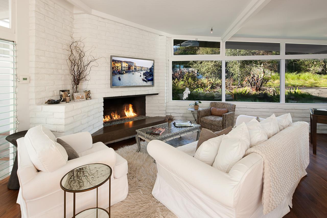 See how white paint tones down the brick of the massive fireplace and wall in this room. Imagine if the brick was still red!
For instance, a hideous brick fireplace will, most likely, be an unwelcome focal point in your living room. Maybe you can't afford to tear it down-- you just wish it would disappear!
You can visually make that fireplace recede and diminish in size and importance if you paint it the same color as the walls beside it.
To expand visually a space (or to hide ugly moldings, window trim, or a hideous radiator), paint the same light color on walls, baseboards, trim and radiator.
Doing so will cause unattractive features to recede, or seemingly disappear by blending in. A camouflage effect of sorts.
Proper color combinations can deceive the eye into thinking that a small room is larger than it really is, or take an awkward space and make it less noticeable:
- Cool, pale colors reflect light and appear to retreat. When infused with natural light, cool colors can visually expand a small room by creating the impression of "pushing back" the walls.
- Warm, dark colors absorb and deflect light and appear to advance or create the impression of the walls closing in on you. Shorten an overly long room by painting the end walls in a warm, darker color then the side walls.
- Interior colors for home staging should have a combination of cool and warm colors in the design palette, but one or the other should dominate.
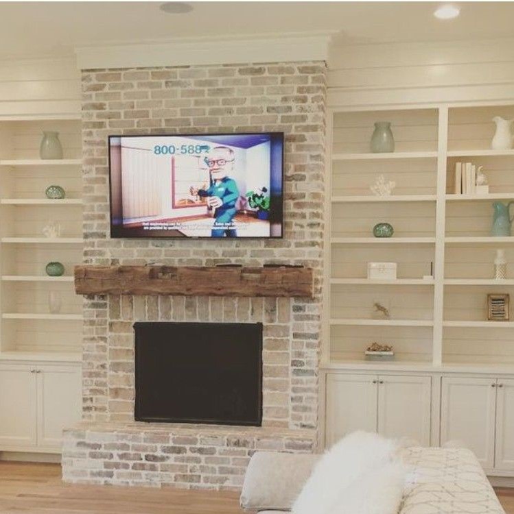 Note how the creamy wall color is carried to the ceiling, visually "raising" the ceiling height.
- Paint a really high ceiling in a darker color, even bringing that color down a foot or so onto the wall, to visually lower the ceiling. The room will feel cozier.
- Visually lift a low ceiling by painting it white or a light pastel hue.
- Paint colors that appear to expand small spaces are white, very pale gray, blue, lavender, and green.
- Make a small room feel larger by hanging window treatments that are the same color as the wall.
- Paint oddly placed doors, windows, nooks, or an awkward sloping ceiling the same color as the walls. This will help unite the broken areas.
- For over-sized rooms, use a combination of warm and darker colors. The dark colors will make the room seem cozier and more intimate.
- Paint dark rooms, like basements and hallways, in light colors to lighten the spaces.
- Try a coordinating color on an accent wall to add excitement to a room or to draw attention to a lovely window, fireplace or other architectural detail.
- If you have a lot of bumps and dings in your ceilings and walls, use a flat paint. Because flat paint doesn’t reflect light, imperfections on walls and ceilings are less noticeable.
The best room color scheme for a small room
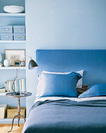
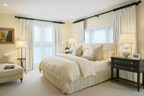 Draperies, carpet, bedding and furniture that mimic wall colors create a more expansive feel in this monotone bedroom.
A monochromatic or monotone color scheme is the BEST color scheme for a small space. This is my favorite room color design, as I find it elegant and relaxing.
What's the difference between monochromatic and monotone? A monochromatic color scheme uses varying shades of one color, whereas a monotone adheres closely to one color of the same shade.
Both room color schemes can be very sophisticated and calming, and done successfully, can create the illusion of a more expansive space.
This room design style is built around one color in varying shades, tints and tones in the wall paint, upholstery, bedding, draperies, flooring and so on. Any color can be used.
A monochromatic color scheme is typically accented with white trim work, lamp shades and accessories.
It may sound boring to design a room around just one color, but by incorporating variations in tones and textures, accessorizing with glass, metal, wood, and objects from nature, you can create a feeling of relaxation, spaciousness and sophistication.
Return from interior colors for home staging to depersonalizing your home
Go to home page
