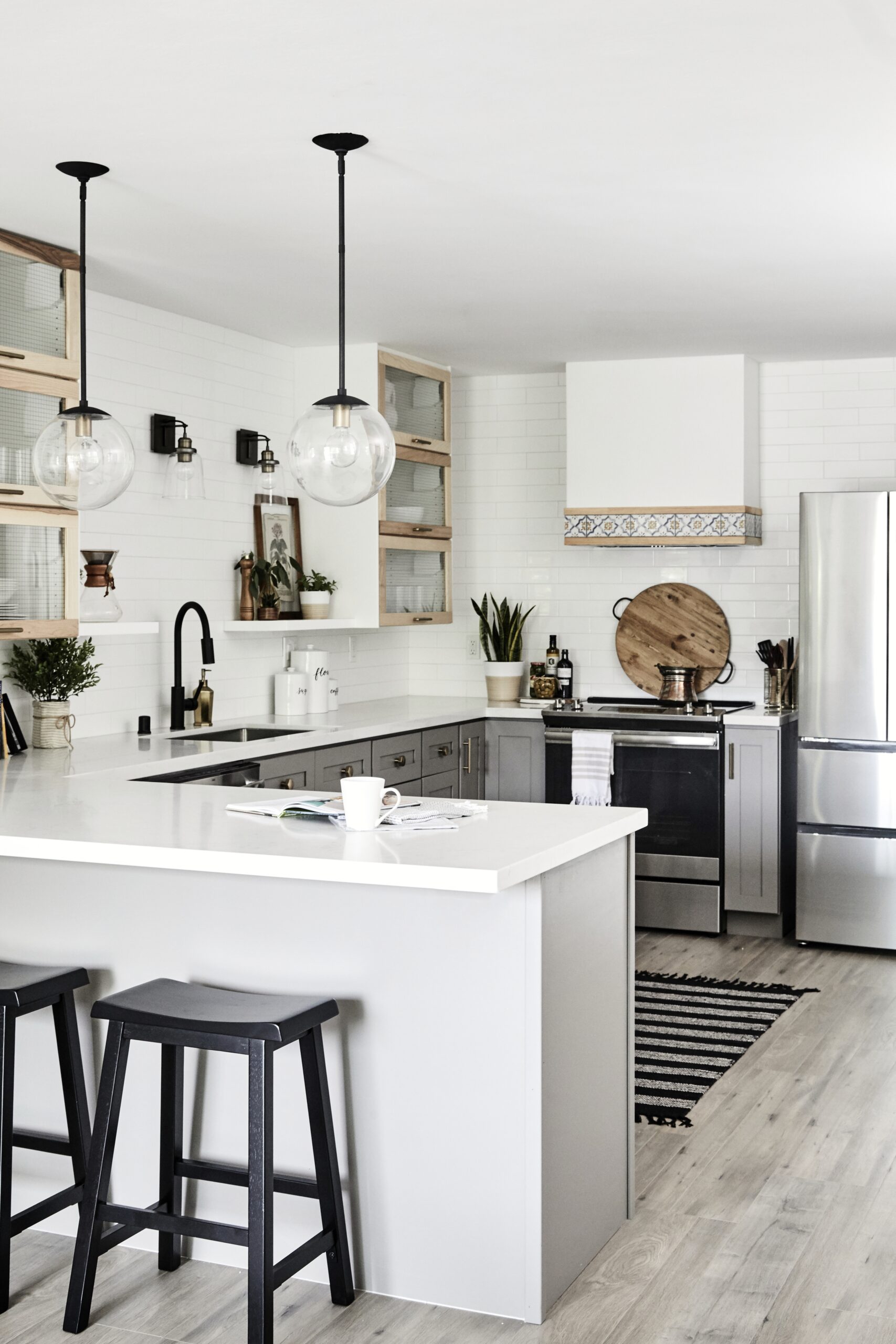
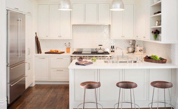
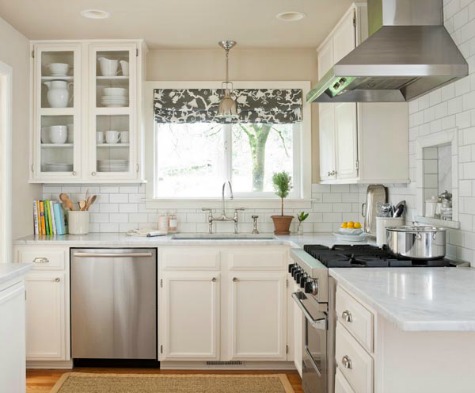
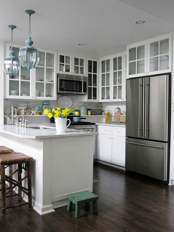
15 Small Kitchen Decorating Ideas
Buyers will Love
For a faster, more profitable home sale
Are you making the most of the space in your small kitchen?
Do you wish there was something you could do to make your kitchen look bigger and function better?
Having a small kitchen is certainly a disadvantage when you are trying to compete in the market place.
Most people know that buyers consider the kitchen one of the most important rooms in the house.
If your kitchen is lacking that WOW appeal, don't despair!
Keep reading to learn some small kitchen decorating ideas that will help your tiny space show better and sell for more money on the real estate market.
Learn how you can make the most of your small kitchen space, from decluttering to staging!
If you are not selling your house, the following home staging tips and tricks will work for you as well.
1. Declutter your kitchen!
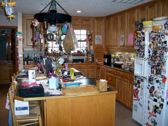 Every thing is wrong in this cluttered kitchen. The bar stools, window, light fixture, fridge, even the ceiling haven't escaped the clutter monster!
I know... groan. If you don't do anything else, DO THIS! I can't emphasize this enough.
Nothing makes a kitchen look more uninviting than countertops filled with appliances, cereal boxes and the usual flotsam and jetsam of items that won't fit inside your kitchen cabinets.
If you are selling your house, now is a good time to pack up appliances for your new home. And dump that microwave-- you CAN live without it! A countertop microwave will inform buyers that there is NO ROOM in your kitchen.
Remove the art gallery on the fridge-- this alone will greatly enhance your kitchen space. Kitchen clutter often finds it's way to the windowsills and refrigerator tops too. Remove it all.
Clear the countertops of all items except your most attractive appliance and a pretty kitchen vignette.
For helpful tips on getting rid of stuff, see declutter your home.
2. Use light, neutral colors
Color is one of the keys to successful decorating— the right colors can work magic by "visually" expanding or shrinking space, even appear to raise or lower ceilings.
Most people respond positively to light, neutral colors, in fact, neutral colors appeal to more people than any other color group.
Dining and powder rooms are often painted in dark colors to make them appear cozy and intimate. Since your goal is to "expand" your small kitchen space, dark colors are the wrong choice.
Always try out a paint sample out on a wall first. Neutral color undertones are often hard to see until they're up on a wall. Be sure to check out the color sample under natural and artificial lighting, as colors look different under changing light conditions.
Employ a light hand when adding pops of color, using no more than two or three colors in a tiny space. Too many colors can make a small space look cluttered.
A Few Color Basics...
- Light colors reflect and multiply light and appear to push walls back.
- White is the most expansive color.
- Dark colors absorb and deflect light, making small spaces feel closed, or "cozy" in real estate lingo.
- Cool colors appear to retreat, while warm colors seem to advance.
- A successful room color palette will have a combination of cool and warm colors, but one should dominate.
- Light warm colors are great for kitchens. Accent warm wall colors by painting trim white for a fresh, contemporary look.
- Kitchen cabinets painted the same light color as the walls will appear to "blend" into the walls, creating a feeling of spaciousness.
- Dark cabinets next to white walls can make a kitchen feel smaller, because of the abrupt color change.
- To create a feeling of maximum space, use the same light color on the walls, floors, cabinets, window treatments and trim.
3. Employ a monochromatic or monotone color scheme
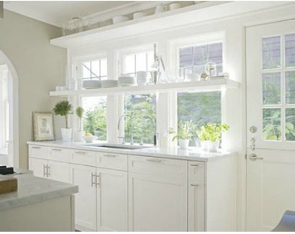 This small kitchen feels bigger because of a monotone color scheme and windows that extend the eye to the outdoors. Note that accessories are white or clear.
One of the best small kitchen decorating ideas you can do is to design in a monochromatic, or low-contrast color scheme.
Monochromatic and monotone color schemes are the most successful color palette for small room design. This style will create harmony, visual cohesion and a sense of relaxation in any room.
This color scheme combines varying shades, tints, tones and textures of one color. Any color can be used, but for home staging purposes, neutrals like white, beige, tan or gray work best.
Swathing an entire kitchen in white will create a uninterrupted space without breaks of color contrast to stop the eye.
This home design tactic fools you into thinking a space is larger than it is. Abrupt shifts from dark to light will trip the eye.
4. Be careful with pattern and texture
Apply pattern or texture with a light hand, as too much of either can overwhelm a small space.
Use pattern or texture in window treatments, accessories, chair cushions, flooring, area rugs or light fixtures. But not all at once!
When light hits uneven textural surfaces, varying degrees of shades of the same color will add interest and life to the room.
Wide vertical stripes on the walls appear to "raise" a low ceiling. Wide horizontal stripes seem to "elongate" a short wall.
5. Replace upper cabinet doors with glass
Swapping out your upper kitchen cabinet doors with glass will add depth to your kitchen.
Your eye will be pulled into the cabinets and to the back, making your kitchen appear larger by extending sight lines all the way to the wall.
Don't use dark or opaque glass and be sure to keep the interiors nicely staged.
6. Use open shelving in a small kitchen
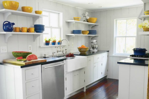
Open shelving, also known as floating shelves, are extremely popular in the 2021 kitchen. Open shelving allows you to display your prettiest dinner ware and add pops of color to your kitchen.
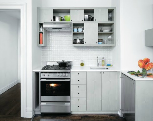
Open shelving "enlarges" your kitchen by reducing the visual weight of heavy cabinetry and adds depth by allowing your eye to travel all the way to the wall.
But, installing open shelving can mean sacrificing a few upper cabinets to make room for them. You must weigh the risk.
Floating shelves are the most effective style of shelving for home staging, because they take up less visual space than those with heavy corbels or ugly brackets.
Decorate your open shelving with clear glass or objects the same color as the wall. Either will make objects seemingly blend into the background.
When accessorizing open shelving, allow plenty of space around objects. This creates breathing room, which translates to that open, airy feeling.
Focus on staging shelves with a few standout accessories, rather then a large collection of small objects, which can look cluttered.
Follow the advice of HGTV interior designer, Sabrina Soto. "Never use an accessory smaller than the size of a grapefruit."
7. Lighting ideas for a small kitchen
Natural light
- Natural light is always the preferred light source for home staging. Natural light flooding into a room has an expansive effect and creates a feeling of space. For the best effect, open the window treatments or remove them completely.
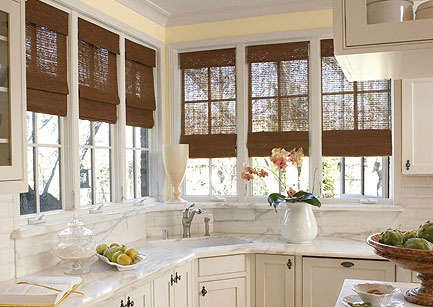
- For a small, dark kitchen, consider installing a large window. Extending sight lines to the outdoors will instantly make a tiny kitchen feel bigger.
- Or, install a skylight or affordable solar tube to bring natural light in from above.
- Hang a mirror opposite a window or where it will reflect a light fixture to scatter and bounce light around the kitchen.
Kitchen light fixtures
A kitchen with insufficient lighting is a depressing place to be. It can be dangerous too. A dark kitchen does not show well.
Dark corners and shadowy recesses along the countertops will strain your eyes and make your kitchen seem smaller.
A kitchen should have a good mix of natural, task and ambient lighting.
- Consider adding under-cabinet lighting to flood the countertops with light. Under-cabinet lighting will improve the look, function and safety of your kitchen.
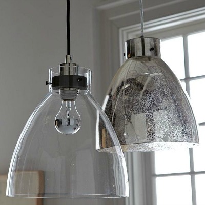
- Install pendent or track lighting. Use clear glass shades to extend sight lines.
- Buyers love the ambience of recessed lighting. Recessed lighting is the answer for low ceilings, because fixtures are flush with the ceiling instead of protruding down into the room.
8. Small kitchen decorating ideas for furniture
- The less furniture you use in a small space, the better! The further the eye can see into a room, the larger it will seem.
- Select furniture with a small footprint to reveal as much floor space as possible.
- Select low profile furniture for adjoining rooms to keep sight lines open. For instance, in an open kitchen/living room, use a sofa with a low back or an armless low-backed chair. In the kitchen, use bar stools without backs.
- Avoid cumbersome furniture with a large pedestal or heavy ornamental carvings. Instead, select furniture with open framework or features that allow you to see the floors and walls beyond.
- If you have room for a small mobile island, select one with an open framework that allows you to see through. Buyers love islands, even mobile ones!
- For eat-in kitchens, consider a dining table with a glass top and open metal legs.
- Remove all the leaves from a dining table and place no more than four chairs around it. See staging the dining room.
- For island seating, choose backless bar stools that tuck neatly under the counter ledge.
9. Do a small kitchen renovation
- Open up a section of a wall separating the kitchen from an adjoining room. It won't increase the size of the kitchen, but will bring in more light and extend sight lines.
- Remove an entire wall between the kitchen and another room. Be sure to have an expert check to see if it's a load-bearing wall before you start any demolition.
- Removing a door will instantly make a small space feel roomier. Widening the door frame will really increase the sense of space.
10. Change the kitchen sink
- Swap out a double basin sink for a smaller, single basin one to give you kitchen a bit more counter space.
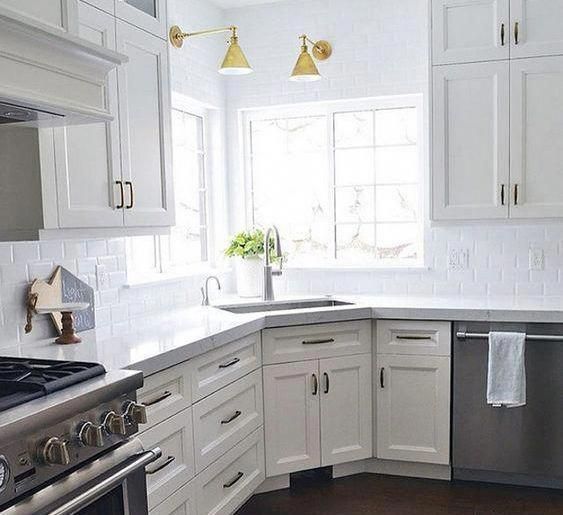
- A really tiny kitchen with little to no counter space will greatly benefit by moving the sink to a corner. This can drastically increase your counter space. Largely frowned upon in the past, corner kitchen sinks are available in a variety of styles that will optimize the look and workability of your kitchen.
11. Floors and ceilings in a small kitchen
Floors
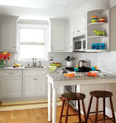
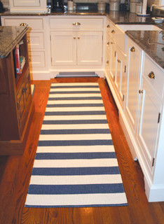 This striped runner appears to widen this tight kitchen. Photo by Houzz.com
Don't scatter a bunch of small rugs around a tiny kitchen. It'll look cluttered and choppy.
Create a long path for the eye to glide along without interruption by placing a long striped runner on the floor.
Horizontal stipes can "visually" widen or lengthen a room. Remember the warning about wearing horizontal stripes? That works for floors too!
Light colored flooring will open up a small kitchen. Dark floors seem to shrink the size of a room.
To avoid abrupt color changes, link adjacent spaces with the same kind of flooring, or at least try to match the colors if your floors are made of different materials.
Ceiling
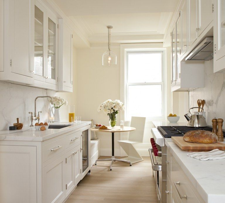 Taking kitchen cabinets all the way to the ceiling creates a strong vertical line with the effect of "raising" the ceiling.
Drawing the eye vertically can make a room appear taller than it really is. If you have a low ceiling in your small kitchen, there are a few tricks you can employ to fool the eye.
- Create a strong vertical line with kitchen cabinets that go all the way to the ceiling. This will have the effect of "visually" raising the ceiling and, as an added bonus, provide more storage space.
- Paint a low ceiling white or another pale color to "visually" raise the height.
- Add accent molding to the tops of the cabinets to direct the eye upward.
- If upper cabinets don’t extend to the ceiling, a FEW well placed accessories, like large decorative plates, baskets, or framed prints along the tops of the cabinets can add perceived ceiling height.
- Use decorative objects with elongated patterns or shapes that direct the eye upward.
12. Select the right range hood for a small kitchen
Range hoods are often bulky, ugly and take up a lot of visual space.
If you're planning to replace your range hood, choose a streamlined or see-through model that takes up very little space.
Or better yet, do away with the need for a range hood by installing a cook top with a built-in downdraft system.
13. Use reflective surfaces in a small kitchen
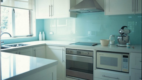
Reflective surfaces, like glass tile backsplash, stainless steel, sleek cabinets and shiny hardwood floors will illuminate your kitchen by amplifying natural and artificial light.
A mirrored backsplash may seem obvious, but they're actually very “taste specific” and require constant cleaning. Instead, put up a light colored tile backsplash that'll reflect light.
14. Fixtures and appliances in a small kitchen
This is the second most important tip of all small kitchen decorating ideas! Kitchen appliances should ALWAYS MATCH if you're selling your home.
As a former Realtor, I witnessed more than one person disengage after seeing mismatched appliances in a kitchen. Buyers are NOT interested in buying new appliances.
Gain a few inches of countertop by installing a 24”cooktop instead of a standard 30-36" one.
No room for a standard-sized fridge? An under-counter model might be the solution.
Make sure that the fridge fits flush with the edge of the kitchen cabinets. Refrigerators that jut into a room can look massive and make your small kitchen look even small and awkward.
Microwaves can be built into cabinetry or hung underneath. Better yet, go without.
Whatever you do, don't leave a microwave sitting on the counter--it screams, "No room!" and takes up precious counter space. Better yet, pack it up for your new home.
15. How to accessorize a small kitchen
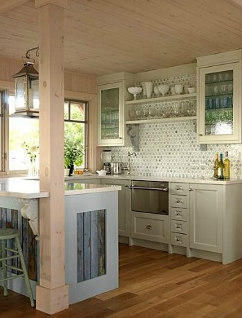 See-through accessories that match the wall color will take up less visual space.
If you need window treatments for privacy in your small kitchen, match them to the color of the walls to avoid contrast in the space.
Avoid hanging window treatments with complicated details, like ruffles, swags and bows.
Use a plain valance, shade or blinds—aim for a clean contemporary look with maximum natural light coming in.
When accessorizing kitchen countertops, keep it simple and sparse. The less objects on your countertop, the bigger your kitchen will appear.
Avoid complicated vignettes with too many objects. A simple bowl of lemons or oranges or one potted plant is sufficient.
Return from small kitchen decorating ideas to home page
